UPDATING YOUR KITCHEN?
When you think about the most important room in your house, most of us would say it is the kitchen. It’s just something about this room that offers the sense of “home”.
Your kitchen could set the tone in terms of decorating style for the entire house or it can just be that special room that has its own style. From different colors to textures, choosing the perfect kitchen for you could be a fun experience. There are plenty of options you can choose from, starting with colors, textures, storage, and appliances. The least expensive option is simply to change out what is seen on your countertops.
The first step is choosing the style you love the most and adapt it to your home.
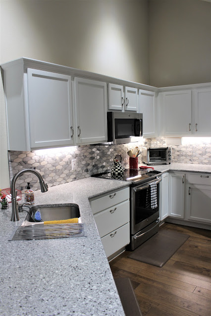
In our Fall HOA Quarterly Newsletter I will be featuring three of the homes where homeowners did a renovation of their kitchen. Each of these homes have the exact same floorplan which makes it interesting to see how they applied their own style and tastes to make this room unique to themselves.
I am going to show you only one of them along with interesting details from the other two.
When our friends Ric and Margaret bought their house in our Village mid 2021, this is much like the kitchen looked. The original cabinets were stained and there were no cabinets on the long wall opposite the oven. There was a high narrow bar separating the kitchen from the dining area.
Margaret met with a designer who was able to give her exactly what she wanted. They used a contractor they had used in a previous home, which helped, but there were still hick-ups and deadline issues. These things are to be expected but not necessarily enjoyed.
The finished project made it all worth while.
As you can see it is a total transformation
They removed the high bar and made the sink counter area all the same level. They retained the original footprint but had all new cabinets built for maximum storage and added a wall of upper and lower cabinets where there had been none.
Margaret chose a granite stone countertop in shades of gray and gold and added a deep stainless undermount sink. The backsplash is a classic white subway tile.
This section of the kitchen is the jewel box of the entire house. It is the first thing you see when you enter the home and a place where you want to stay. Ric used LED string lights inside the cabinets to highlight the beautiful door design. He also used them underneath to light the serving area.
As might be obvious Margaret's favorite color is blue and she has carried that color in various accents throughout. To anchor the tall upper cabinets she painted the lower ones a deep navy.
Carrying out a theme and adding accent colors, offers a serene atmosphere that will make your kitchen feel clean, refreshing, simple and visually pleasing.
Cabinet door knobs can add a bit of whimsy and interest, and even a touch of elegance to an otherwise plain door.
Patsy added these clear acrylic knobs, with a touch of brass to help carry out a theme that runs throughout her house.Personal accessories that add accents and meaning are very important to any room, but especially the kitchen. These are excellent conversation starters while guests are gathered around food.


.JPG)


.JPG)


No comments:
Post a Comment
I do love reading your comments, so please share your thoughts with me.